Slack Update
—
UX
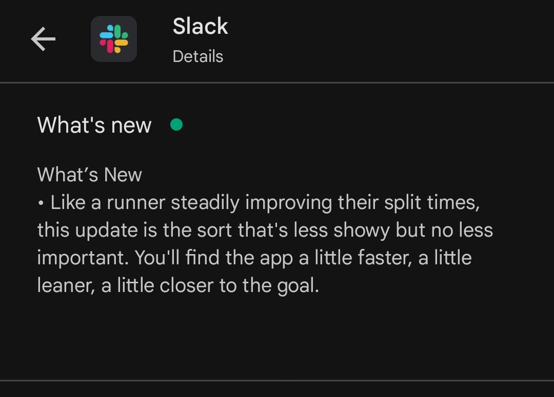
The new slack update brings a lot of joy and quirks. In general I like it. But some things are questionable.
For example:

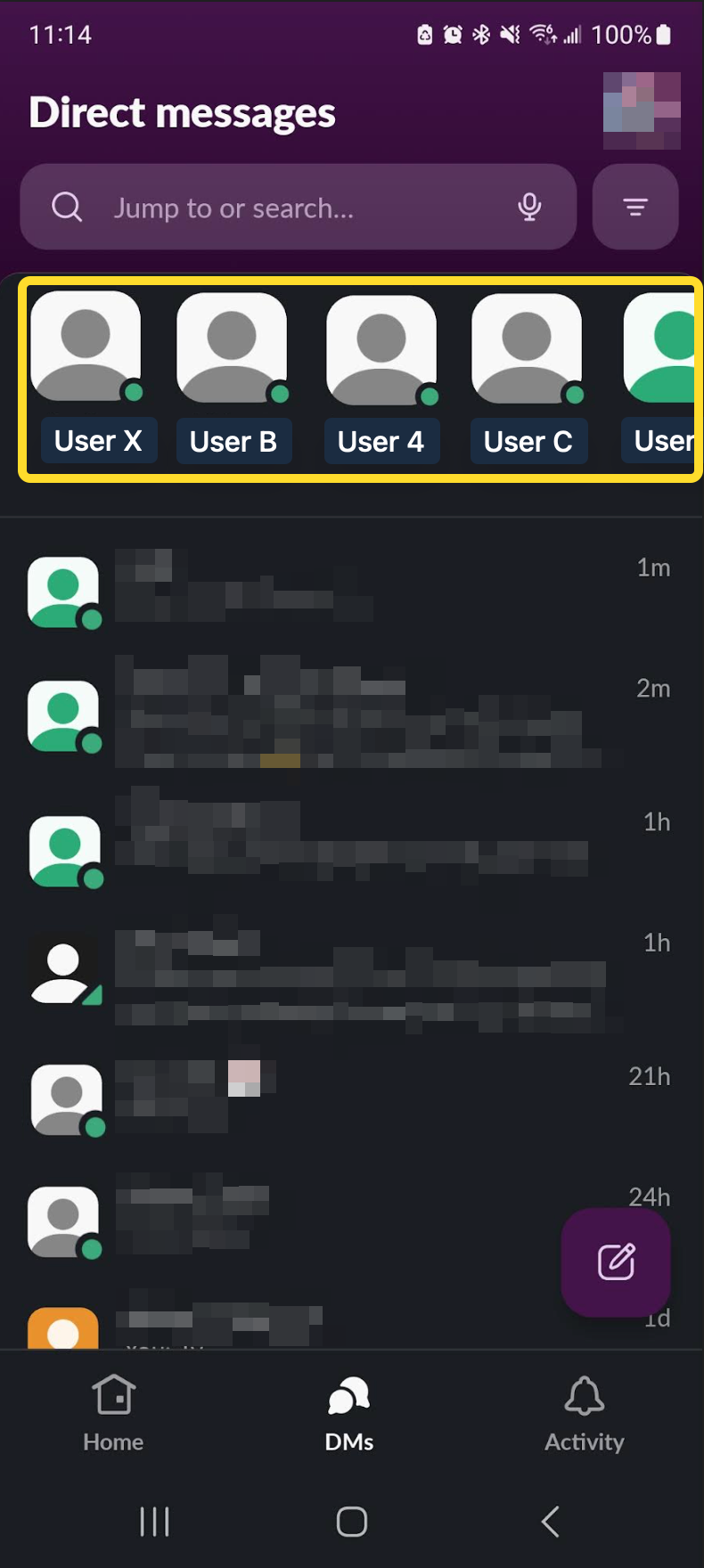
What the people in yellow box represents?
- Are they latest people I talked to? - No
- Are they people I talk the most from all times? - No
- Are they alphabetical? - No
- Are they online? - Maybe
- Are they random? - Most defiantly yes!
Does it says something in the first place you would look?

- No.
I understand that it is pretty hard to show changes explanation on mobile. But making users guess is not the answer!
