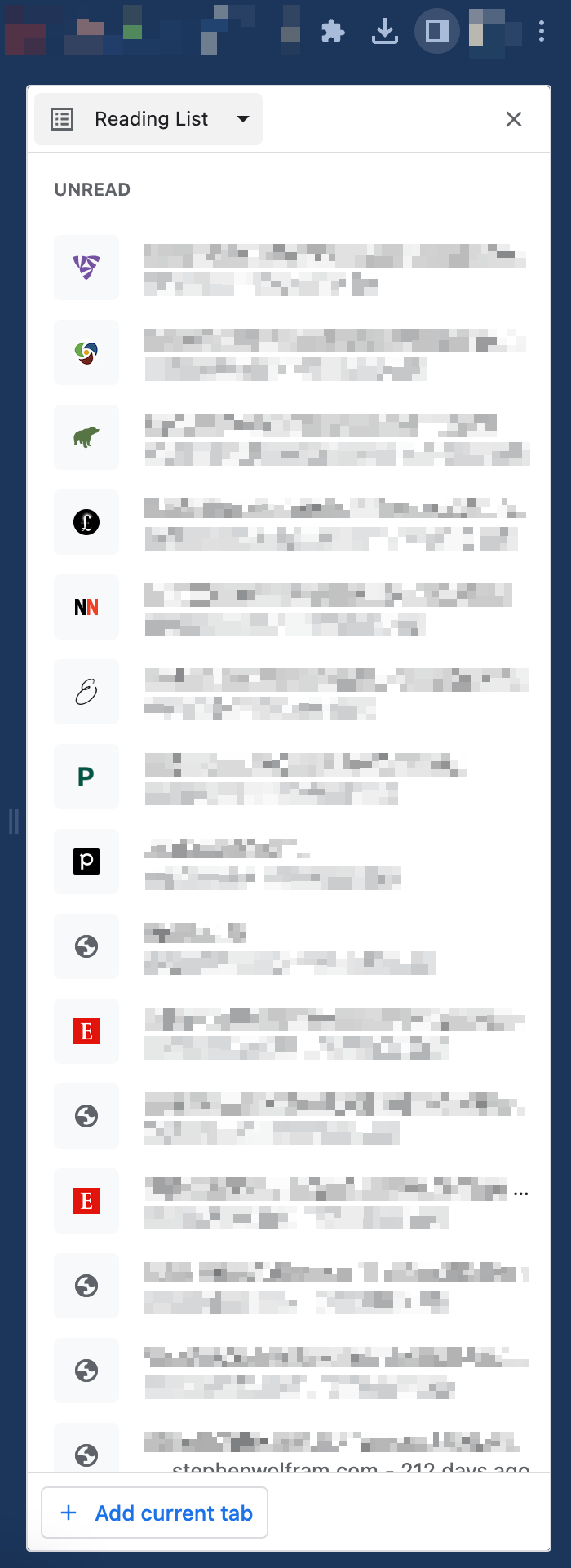
Chrome Reading List
Google Chrome has an amazing new feature called “Reading List”. It lets you save pages to read it later. Remarkable.
However UX decision is rather questionable.

Why “+ Add current tab” button is down below? This is whole page cursor journey after you click to open this side bar that is on the very top of the browser. It is likely fine if you have small screen, but if you are using something decent like 4k monitor it.
The much better UX would be to add the “+ Add current tab” button to the very top like this:

Chrome team, if you listen, please make it better.
